The Capstone Showcase is the culminating event for the Capstone course sequence. Design teams will make formal presentations of their project during parallel sessions (multiple presentations happening at the same time). After the presentations, teams will have a table to display design artifacts and a poster.
The MME Department will coordinate the production of the posters.
Presentations, 12:00 - 1:50 PM, Thursday, June 7
Presentations will be in three parallel tracks in EB 102 and two other classrooms (TBD). Each team will have 15 minutes to present their project.
Showcase, 2:00 - 4:30 PM, Thursday, June 7
After the presentations, teams will display their design artifacts and a poster to students, sponsors, faculty and other visitors. Volunteers from the community will act as judges of the teams poster presentations and ability to answer questions about their design.
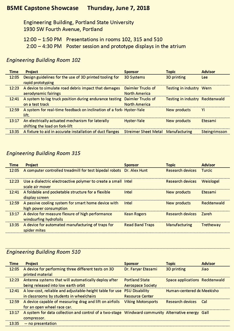
Download the schedule as PDF or Excel sheet
Advice on Slide Presentations
In the following sections I provide some advice on preparing your slides for your team presentation at the Capstone Showcase. Apart from the advice, there are a few requirements
- All team members need to be present
- Presentation duties can vary, anyone not presenting must be available at the front of the room, to answer questions
- Your team must be present for all presentations by all teams in your session. Student's arriving late or leaving during presentations by other teams will cause a loss of points for their team.
Goals
Your final presentation is a chance to tell the story of your team's work for the past 6 months. No doubt you will feel a little nervous and maybe even worried about the work that would be so-much-better-if-you-only-had-another-few-weeks. Nevertheless, time is up and we want to hear your story. Trust your work and your team.
To satisfy the requirements of the course, your presentation should:
- Explain your design problem and your solution to it;
- Show the audience that your team has done design work at a high level. Specifically, show
- that you used design methodology – not ad-hoc decision-making,
- that you used engineering analysis to support design decisions
- that you have concrete, quantitative evidence demonstrating that your design meets or exceeds requirements
- Encourage audience members to visit your poster;
- Use good presentation skills to make preceding points informative, persuasive and enjoyable.
The reminder of this web page describes presentation styles and the recommended components of your presentation for the Capstone Showcase.
Designing a Presentation
A google search on "Death by PowerPoint" reveals that many people are turned off by the default format and style of slide presentations. Although "Death by PowerPoint" has become an overused meme, the problem persists. Michelle Davis gives a balanced overview of the problem and a discussion of alternatives.
Minimize Use of the Default PowerPoint Style
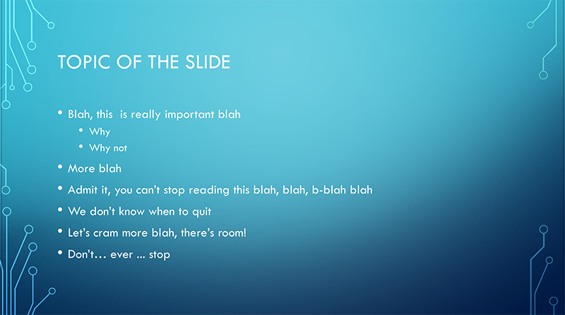
The default presentation is a sequence of slides, each with a topical header followed by bullet points. Figure 1 shows an example created with the "Circuit" template in PowerPoint. This style is familiar, boring and not particularly effective.
Do as I say …
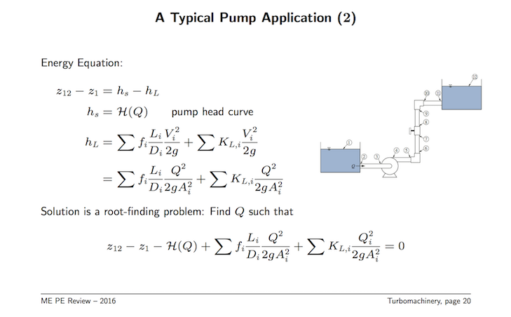
The default style for an engineering slide is crammed full of equations and diagrams. Figure 2 is an example from my PE Review lecture slides. That slide is only helpful for someone to study later, after the presentation is over. Nancy Duarte advocates using this dense style of slide document as a supplement to presentation slides, not as the content for a presentation slide.
The basic lecture in engineering courses – the experience you have had as an audience member for the past N years – is not a good model for effective presentations. Faculty make between 1 and 4 (and sometimes more) presentations per week. Rarely is there time to polish the slides unless and until the lecture has been repeated several times. By then, the lecture slides are so crammed full of information that the presentation becomes a race to finish.
Instead of emulating lectures from your courses, take cues from story-telling to provide a structure and visual theme to your presentation, and use the assertion-evidence style to convey technical information. These ideas are discussed in the following sections.
To risk redundancy for the sake of being clear: Figure 1 and Figure 2 are not good models for your presentation at the Capstone Showcase.
Telling a Story
There are many alternatives to presentations confined to the standard PowerPoint slide deck. One key idea is to recognize and use the power of story-telling. My advice is to be aware of, and use story-telling principles, combined with the assertion-evidence and words-in-tables techniques for individual slides.
For a good introduction to how story-telling can be used in slide presentations, watch Why storytelling matters, a 15 minute video presented by Garr Reynolds at the 2014 Kyoto TEDx conference. Please heed the advice at 3:08 in the video: Turn off the computer. By that, Reynolds means that you should design your presentation using sticky notes, pencil and paper before you sit down to create any slides in PowerPoint.
What's In a Story
While there are variations on the technique, the basic story-telling idea involves the three act structure: the setup, the conflict and the resolution. In story-telling presentations this often is translated to
- Identify the problem
- Show the solution
- Call to action
The last step, call to action, fits well in a business or marketing presentation where the speaker is trying to persuade the audience to join the team, buy the product, fund the business, or to act in some other way to support the speaker's cause. For a capstone presentation, you can think of the call to action step as getting the audience to accept and use your design. You might also see it, and this should be very subtle, as a job interview where the call is to hire your team.
Figure 3 shows how the three-part story structure can be adapted to your presentation for the Capstone Showcase. The first column lists the three basic elements: Problem, Solution and Call to Action. The middle column translates those basic elements to ideas that fit the goals of the Capstone Showcase presentations. The last column gives specific ideas (in bullet-point format, yikes!) for slide content.

The ideas from the story format is useful for engineering Capstone presentations because, at its heart, story telling is about engaging the audience. You want the audience to be leaning forward (at least mentally) with interest and engagement. If you march through a formulaic set of bullet-point slides describing what you did, the odds of the audience leaning forward are slim.
Presenting Evidence
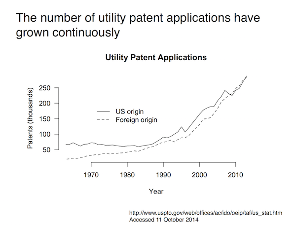
The assertion-evidence format is useful for engineering and science presentations. You make a claim (an assertion) in the title of the slide, and you provide evidence in the body of the slide. Figure 4 is an example of the assertion-evidence format. The title, The number of utility patents has grown continuously is a claim, not really a title. The claim asserted in the title is supported by the plot. This combination is effective because it makes the purpose of the slide clear, and directly persuades the audience to accept the claim based on evidence.
The Assertion-Evidence format is fundamentally different from the stock format found in slide templates. In a conventional slide design, the topical title merely gives an idea of what the slide is about. At best, a topical title provides a category for the information on the slide. In the assertion-evidence format, the title of the slide unambiguously tells the reader what is important about the slide. As explained on https://www.assertion-evidence.com,
In the assertion-evidence approach, you build your talk on messages (not topics) and you support those messages with visual evidence (not bullet lists).
The claim is that
This approach will help you to create better understood presentations, as evidenced by tests of audience comprehension. In addition, the approach will make your presentations more focused and help you to project more confidence.
As a first step, you can use the assertion-evidence format on slides that present engineering data, instead of rewriting your entire presentation to use this format.
Words in Tables
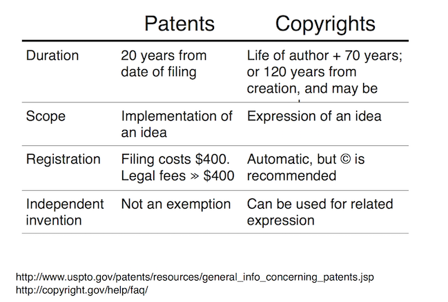
In his book How to Make an Impact, John Moon describes the Words in Tables format as an alternative to bullet points. You can read a one page summary of the idea. Figure 3 (above) and Figure 5 (below) are examples of the Words-in-Table technique of summarizing ideas without bullet points.
The words-in-tables format has at least two advantages over the bulleted list. First, it makes any information hierarchy explicit, e.g. concepts on the left and details on the right. Second, it visually facilitates comparisons across related items.
A words-in-table slide can be combined with the assertion-evidence format. In that case, the words-in-table format becomes another way to present the evidence that supports the assertion at the top of the slide.
Components of a Capstone Presentation
Given the preceding information about presentation formats and techniques, you may be wondering, "Just what should we put in our slides?". To begin an answer that question, first re-read the goals listed at the top of the page. As you choose content to your slides, ask whether and how well your content supports those overall goals.
At a practical level, I recommend that you start with the list of elements in Ideas for Slide Contents, below. Keeping in mind the power of story-telling, and using both assertion-evidence and words-in-tables format for individual slides, the list of elements should be used as a conceptual guide, not a recipe. For example, each of the 11 elements listed below has a text title. Those titles should not, in general, be used as titles for your slides.
Ideas for Slide Contents
-
Brief team introduction
- Problem description
- Motivation: Why should we care
- Project Objective Statement: Goal in a nutshell
- Key Customer requirements
- Show just the most important customer requirements
- Make sure that the customer requirements are not only important, but clearly understandable to the (smart, professional) audience
- Key performance metrics
- How did measure design outcomes so that it meets customer requirements
- Your audience will know that your are pretending or hiding something. Be honest. Be transparent
- Biggest challenges and solutions
- Don't complain about your assignment, but point out what was most difficult
- Show one or at most two big problems that you overcame
- Design concepts
- Give an example of your creative thinking in generating concepts
- Provide some evidence of how you selected viable concepts
- Show conceptually how your design works
- Subsystems
- Show images of your key subsystem
- Show how the systems work together to solve the problem
- Final Design
- Summarize your final design – this is the first half of the climax of your talk
- Final performance vs. Key Customer requirements
- Show how, or to what degree, your design meets the key requirements. This is the second half of the climax of your talk
- Show proof of how well you have solved your problem
- Conclusion – Recap your story
- Where you started – Customer requirements
- Where you ended – proof of satisfying customer requirements
- Recommendations for next steps
- Any unfinished pieces?
- What you learned
- What should be done next
Final Advice
Here is a list of things to consider as you edit your slides.
- Choose a plain slide format.
- The content of your slides is much more important than fancy themes.
- A white background is fine. In fact a plain background is better than the visually busy backgrounds that are typically included in the default templates.
- Use images to support your words.
- Images amplify content, not substitute for it
- Use engineering/scientific plots instead of equations. Equations are OK, but given the time available for your presentation, and the context, plots are better.
- Avoid filling slides with words
- Words on slides compete for audience attention.
- If you provide the words instead of the slide, the audience will more likely be paying attention to you.
- Use the spell-checking feature of your presentation software.
- Minimize the odds of an embarrassing, and preventable, mistake on your slides.
- Practice, practice, practice
- Don't memorize what you are going to say.
- Face the audience, make eye contact.
- Know how much time per slide – have a teammate watch the clock.
References
There are several books and web sites on presentation techniques that transcend the standard PowerPoint format. For advice on the story-telling model, look at these books. (Amazon links are given as a convenience, not as an endorsement to buy more stuff.)
- Presentation Zen and Presentation Zen Design by Garr Reynolds
- Slideology, and Resonate by Nancy Duarte
The authors of those books also have YouTube videos
- Nancy Duarte: How to tell a story – 3 minutes
- Duarte Design's Five Rules for Presentations – 4.5 minutes
- Garr Reynolds, Why storytelling matters - 15 minutes
and they have these web sites
For the Assertion-Evidence format the standard reference is The Craft of Scientific Presentations, which has a companion web site with much more information.
Don't go out and buy those books before you create the presentation for the Capstone Showcase. Store these references for future study in your career.