Updated 5/29/2018:
The due date for the poster upload to D2L has been extended to 11:59 PM on Thursday, 5/31/2018. This is the last change in due date.
Updated 5/24/2018 to include link to LaTeX poster template and to correct an error in the date of the showcase
Each capstone team will submit a PDF file that can be printed on poster-sized paper 48 inches wide by 36 inches tall. The posters will be used as part of the display for the Design Showcase on June 7. The posters must be submitted to the D2L dropbox by May 31, 2018. The MME Department will coordinate and pay for the production of the posters.
Short Version (of these notes)
- Work as a group to develop a prototype of poster content
- Use the templates provided: Do not change the overall size.
- Upload the PDF version to the D2L drop box
Templates
Use one of the following templates as a starting point for your poster.
-
PowerPoint Template 1 for four-column format similar to Figure 1, below;
-
PowerPoint Template 2 for three-column format similar to Figure 2, below;
PowerPoint is recommended because it is ubiquitous. For those who prefer LaTeX, here is a Beamer equivalent of the four-column layout courtesy of Greg S.
- LaTeX Beamer template for four-column format similar to Figure 1, below;
The templates have text boxes to define space for text and images. I recommend that you keep the column widths and adjust the number and height of the boxes to fit your content. The text boxes contain suggestions for content of the boxes. Please replace that text with your own words that are relevant for your project.
To design your poster, I strongly recommend that you start working with sticky notes or other paper and pencil methods before your start working with the PowerPoint version of the poster. Refer to the Initial Planning and Work with Sticky Notes sections below.
The templates were derived from those created by Colin Purrington. The originals, as well as advice for creating posters, are found on his web site.
The templates are designed to print at the correct size. The font sizes are appropriate for the physical size. Do not start with a standard PowerPoint file and scale up the images at the time you print to PDF.
The remainder of this web page provides recommendations for creating the poster content.
Overview
A poster is a visual abstract of your report. The poster has words and images that tell the outcome of your Capstone project. You will use your poster as a visual aid in discussing your project with vistors to the Capstone Showcase. And although the poster will help you while you are talking, the content of the poster should also be sufficiently clear and self-contained that a visitor could understand your project just by reading the poster.
As you start to develop your poster, ask, "what key images (CAD models, schematics, wiring diagrams, photos) are most helpful in explaining the core idea of your design?" You will not have enough space on the poster to include all the important details. You will need to choose images and text that allow you to explain the most important features of your design, and how you can prove that your design works. Do not cram too much information into the poster.
Although your poster is due more than one week before the Capstone Showcase, try to include information about the latest version of your design. In other words, your poster should represent the final summary of your project, not what you are still planning to finish.
Initial Planning
Before sitting down with PowerPoint to create your poster document, work as a team to prioritize content for inclusion in the poster. Have members of your team practice (out loud!) giving a 5 minute summary of your project. Other team members watch and take notes. Work quickly and take turns. In other words, iterate on prototypes of your poster before committing to the effort necessary to layout the poster in PowerPoint.
What visual aids would be helpful while giving your 5 minute summary? The answers to that question give you clues about what to include on your poster. What topics can you fit into a 5 minute explanation? The answers to that question give you clues about what you should and should not include on your poster. Don't take these 5 minute limits as absolute. You probably won't be able to anticipate all of the questions from visitors to your poster. It also OK to have a little extra information on your poster – just don't overdo it. The point of thinking about a 5-minute limit is that you need to prioritize content.
Repurposing Images and Text
For the Capstone Showcase, your team will use three different communication formats: written reports, stand-up presentations, and posters. You can (and should!) re-use images and text for these different formats. You you should also recognize that what is optimal for one format may not be optimal for other formats.
For the poster, bias your content toward words and images that are self-explanatory. In other words, assume that folks will be reading your poster without you being present. That doesn't mean you should "dumb down" your poster. Rather, it means that images and short text passages need to provide both information as well as sufficient context necessary to understand that information.
Prototype with Sticky Notes
- Collect ideas (see Initial Planning, above) and copy these as cartoons onto large sticky notes. The sticky notes are surrogates for the figures, schematics, photos and text blocks that you will eventually incorporate into your slides
- Arrange the sticky notes on a blackboard, wall or whiteboard in an order that helps you tell the story of your project.
- Practice giving your 5 minute presentation again, this time with the sticky notes as your visual aids. In other words, the sticky notes attached to the wall are a prototype of your poster
- Revise the content of your sticky notes and rearrange them. Go back to step 3.
After a few iterations of the preceding steps, you should have a good first draft of the content of your poster. Now you are ready to work with those ideas in software.
What are the clean images (CAD models, plots, photographs) that correspond to the cartoons on the sticky notes? Do you already have those images, or do you need to create new ones? Any effort at developing images for the poster will benefit your work at writing a final report and at creating a presentation for the Capstone Showcase. (See Repurposing Image and Text, above.) The images may not be identical for those three communication media, but they should at least be close in broad content, if not in detail.
Layout
Figure 1 shows the layout of a basic four-column poster. At the top is a header that spans the width of the poster. The gray boxes represent areas of content that are not necessarily contained in crisply delineated rectilinear boxes. In Template 1, the vertical columns are further divided into text blocks.
The blue arrows show the order in which the information should flow on the poster. Do not make a random or even slightly random arrangement of information. Use headings and an orderly progression of ideas to allow a visitor to quickly and effectively learn about your project. Assume that there will be several lurkers for every person who stops to ask you a question.
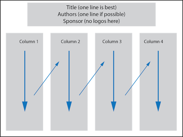
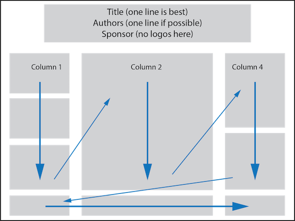
Figure 2 shows an alternative three-column layout with unequal width columns. As with the four-column layout, the text reads top to bottom and left to right. In Figure 2 and in Template 2, there is a row of text boxes along the bottom of the slide. These provide additional information (references, acknowledgements, contact information) that is secondary to the main content of the poster.
The layout depicted in Figure 2 suggests that any one column can be further subdivided into boxes. The layout in Figure 2 allows for a large block of related material to be grouped in the center of the poster. Although a reader would follow the blue arrows in Figure 2, the center column has more weight – both visually and in terms of the substance of the work being described – than the smaller columns on either side and the information in the bottom row.
Advice on Details
-
Start with the templates provide for you.
-
Template 1 is a PowerPoint file (pptx) that uses the four-column format similar to Figure 1
-
Template 2 uses a three-column format similar to Figure 2
or
-
LaTeX Beamer template for four-column format similar to Figure 1.
-
-
Use large enough font for the title, headings and body text.
- Use fewer words
- Not empty, but not crowded
- You should be able to read the text of your poster out loud (not in your head) in 5 minutes (10 minutes maximum!)
-
Adjust the size of the text boxes to fit your text and images. If you need more vertical space, you can reduce the (vertical) size of the title/author/sponsor block. Be careful not to crowd the content.
- Print your poster on standard 8.5 x 11 inch paper (in Landscape mode). Hold the paper at arms length. If you cannot read your poster (printed at 8 1/2 by 11) then your fonts are not big enough.
Sources of advice
- Colin Purrington's tips on Designing conference posters has a lot of do's and dont's. Read and heed his advice.
- LiLynn Graves' Scientific Poster Design
- NYU How to create a research poster